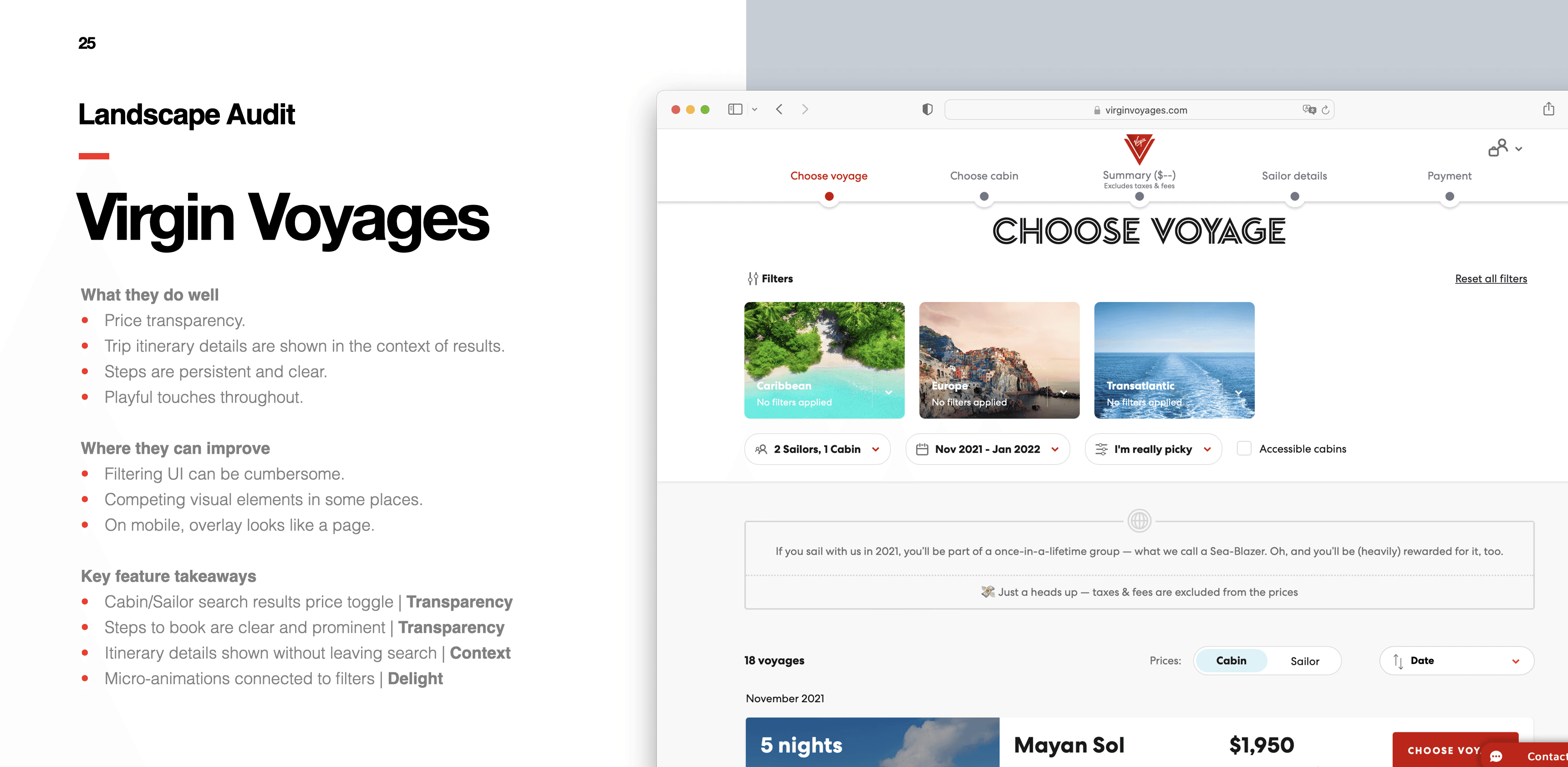
Royal Caribbean
Making it easy to discover, compare and book a cruise
I led a major redesign of the cruise discovery and booking journey that addressed business challenges and received excellent customer feedback for Royal Caribbean, a cruise industry leader.


Project goals
Uncover and resolve usability, accessibility and design issues
Ensure new business strategy is reflected in the customer journey
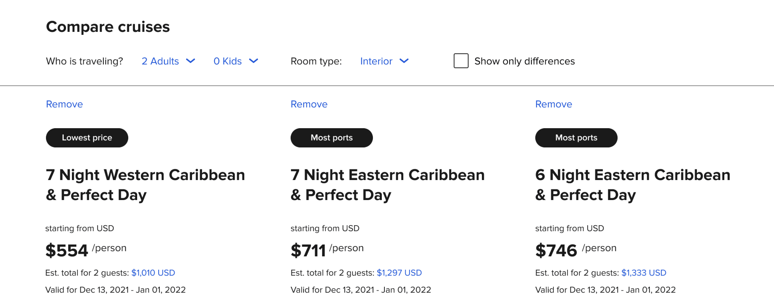
Design and test a new cruise comparison feature
Test redesigned experience with current and potential customers
My role
I led research, strategy, experience design, prototyping and usability testing of the redesigned cruise discovery customer journey. I worked closely with a small team at Fantasy and had regular check-ins with Royal Caribbean.
Discovery
Defining the problem
Royal Caribbean stakeholders walked us through their goals, challenges, thoughts on the current experience and upcoming initiatives.
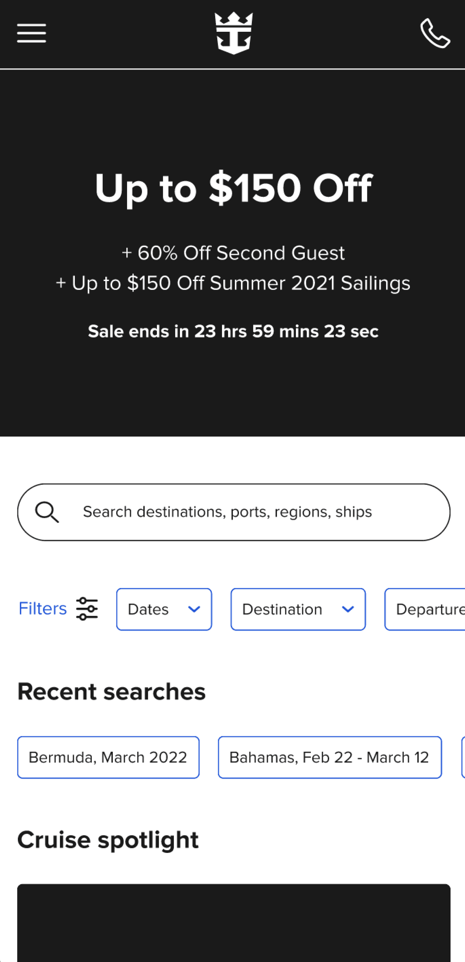
What we inherited
I noticed design and usability issues in the existing customer journey right away. Fixing them alone provided an opportunity to significantly improve the experience.

Making sense of client inputs
Royal Caribbean provided us with a list of issues collected over several years. I organized them and created a list of questions for our kick-off meeting.
Competitive analysis
How do other companies handle similar challenges?
To get a better understanding of the problem space and uncover inspiration for potential solutions, I started with a review of the competitive landscape.
I also looked at novel approaches in related and unrelated fields outside the cruise industry.


We highlighted specific enhancements to give our Royal Caribbean colleagues something to react to at our upcoming collaborative workshop.
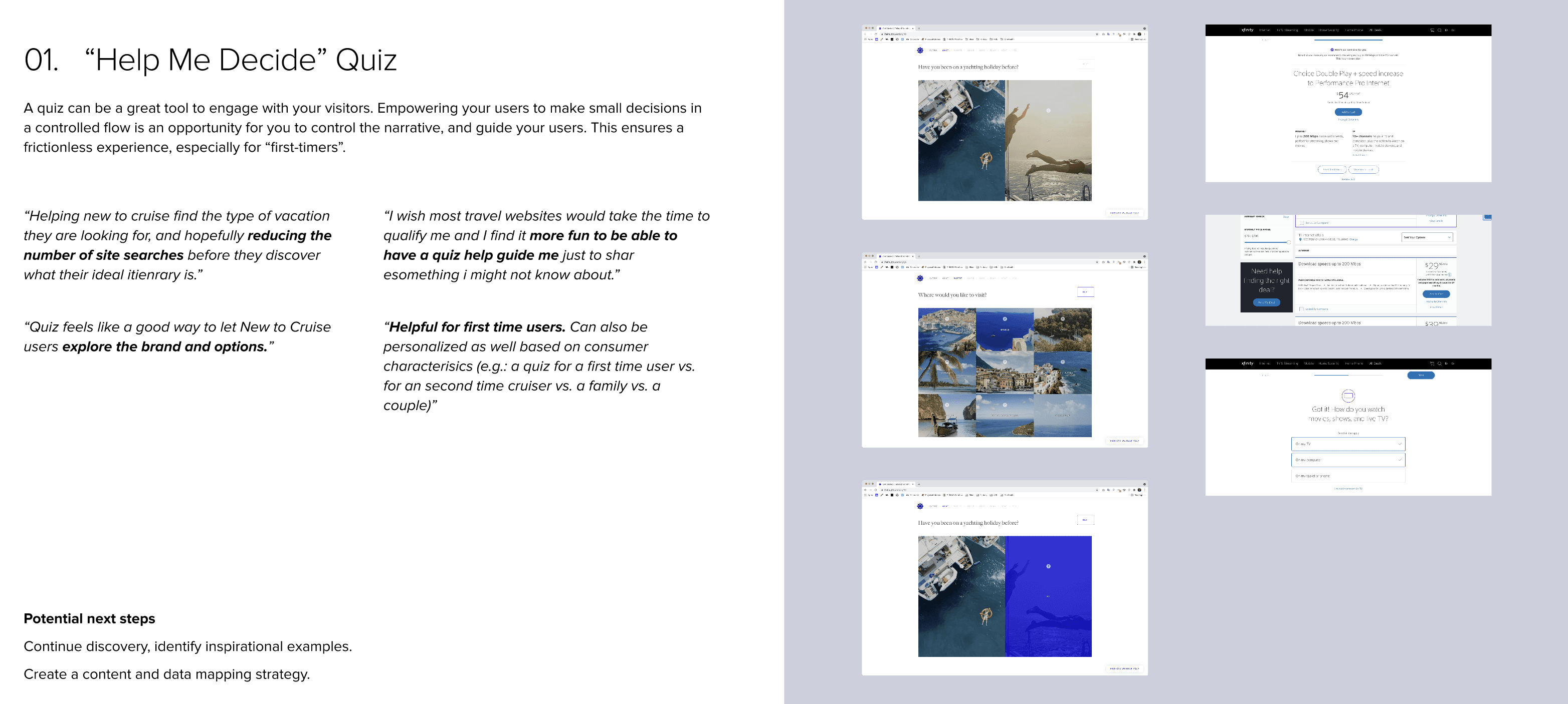
I noticed a lot of mimicry in the cruise industry, which gave us an opportunity to differentiate our redesign considerably by addressing real customer needs.
Brainstorming workshop
There are no bad ideas
I led Royal Caribbean through a collaborative workshop where we reviewed takeaways from discovery, generated and ranked ideas and had a lively discussion.
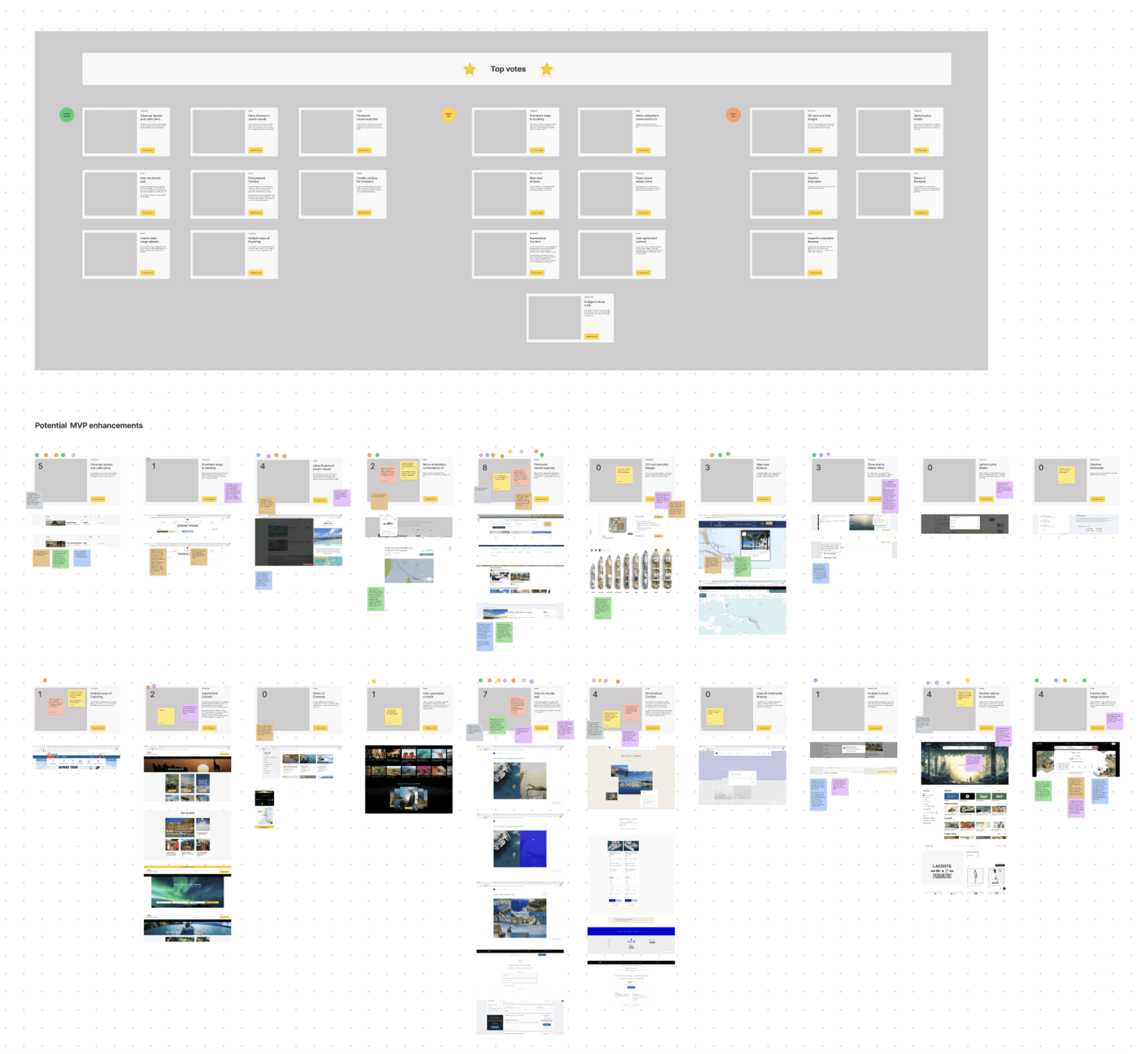
The workshop gave us a good sense of which ideas to explore further.
Wireframing
Exploring new approaches
Armed with a roadmap of challenges and constraints, it was time to explore and capture ideas for the new customer experience.
Rethinking cruise discovery
I started by capturing key tasks like searching and filtering in Figma wireframes. Since 60% of first-time site visits were on a phone, I designed the mobile experience first.
I then optimized the tablet and desktop journeys to take advantage of the extra screen real estate.

Tailoring comparison to cruising
Conversations with customers helped me group and prioritize the most important cruise attributes, to help people quickly scan lots of information.

Usability testing
Listening and observing
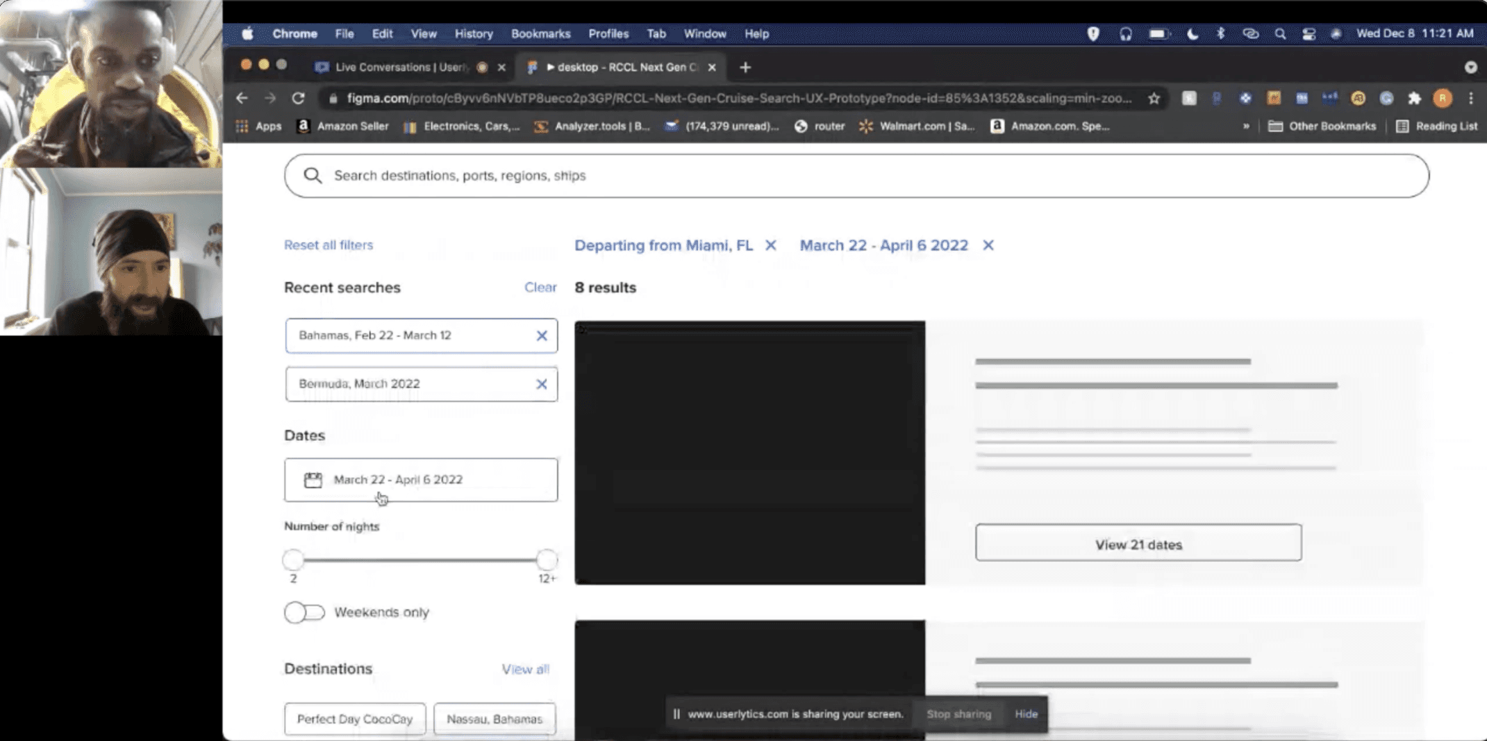
I tied the experience together in a Figma prototype and used it to test the redesign with customers and get stakeholder feedback.
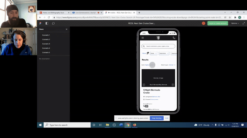
I used Userlytics to conduct several rounds of moderated remote usability tests. This ensured we were designing for real needs and weren't introducing new issues.
Observing and talking to customers proved immensely valuable. In addition to uncovering issues, we got a number of valuable feature and content suggestions.

Uncovering patterns in a sea of data
I used the "rainbow sheet" method to summarize and synthesize test results. It allowed for trends and patterns to emerge visually.

To optimize our design process, I placed notes with actionable takeaways from testing next to where I observed the issues.
Iterating
Fine-tuning the experience
I continually made updates based on usability testing takeaways as well as feedback from customers, my team and Royal Caribbean.
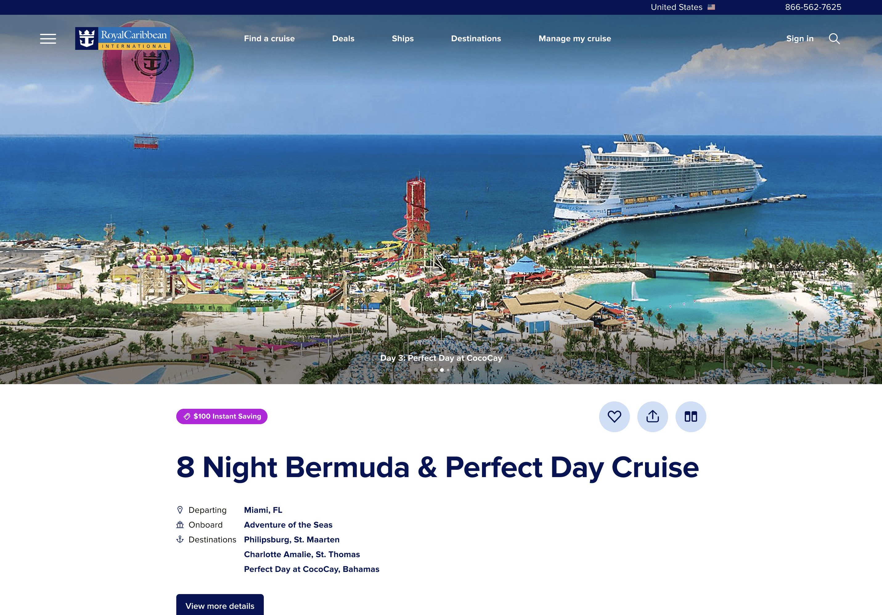
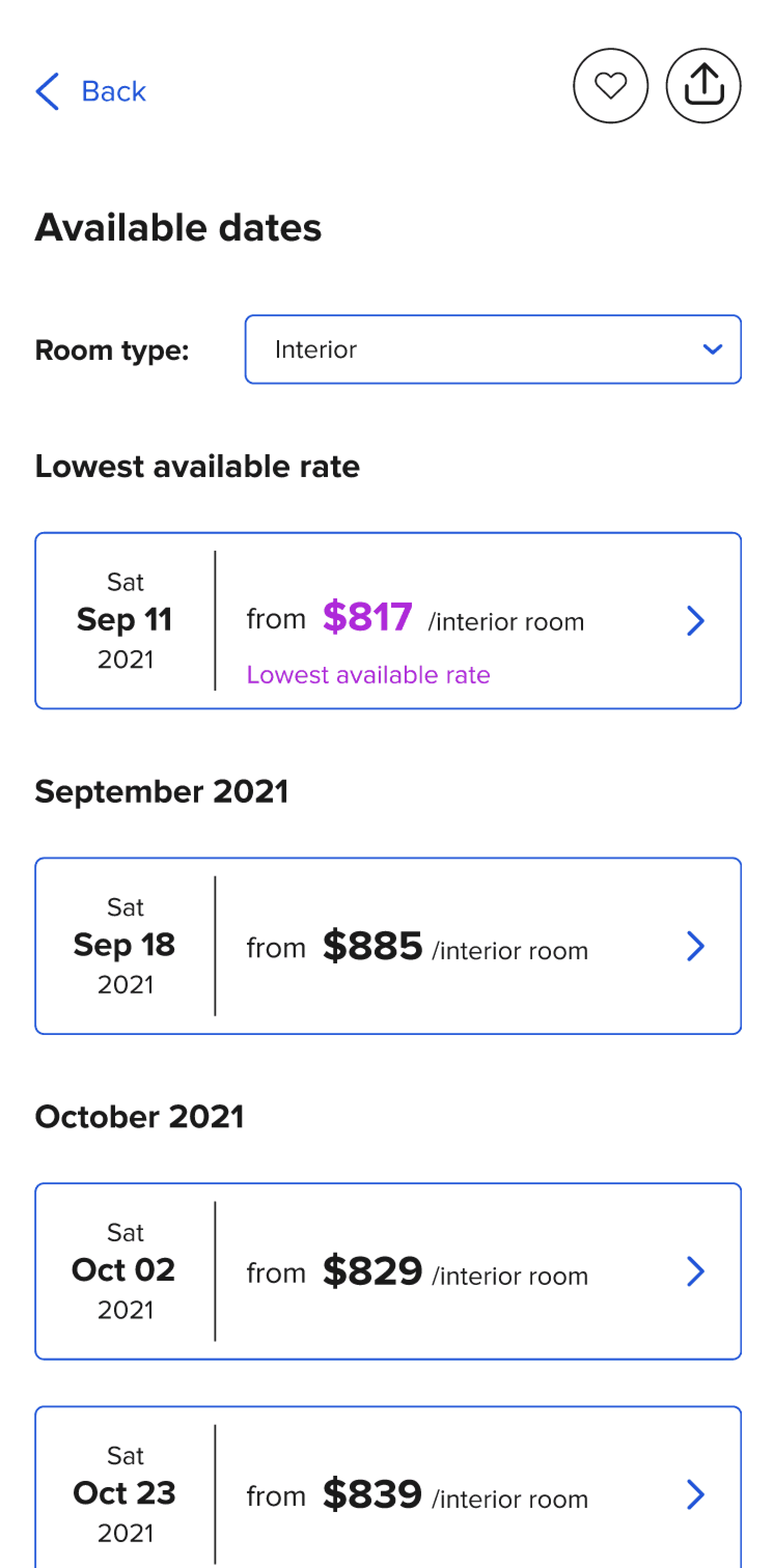
Optimizing cruise details
This example shows the evolution of the cruise details screen. In version 2 save, share, departure port, ship name and room selector have more prominence.

v1 (before)
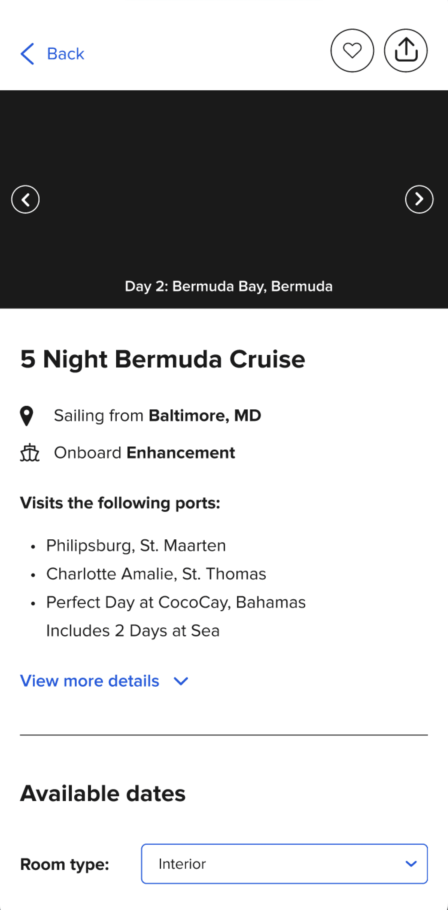
v2 (after)
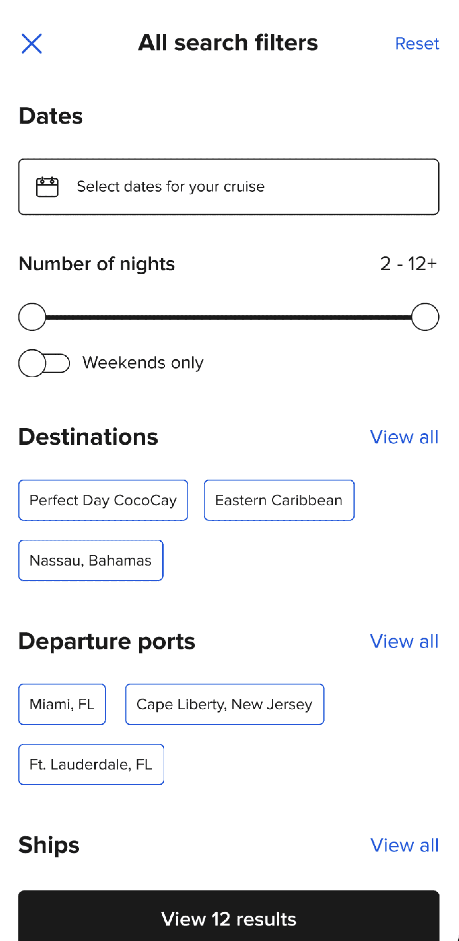
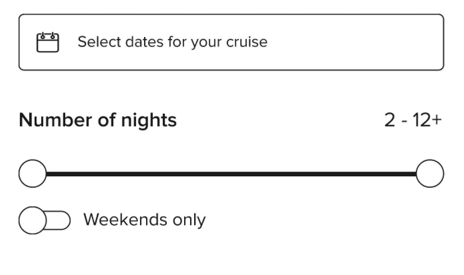
An option for weekend cruisers
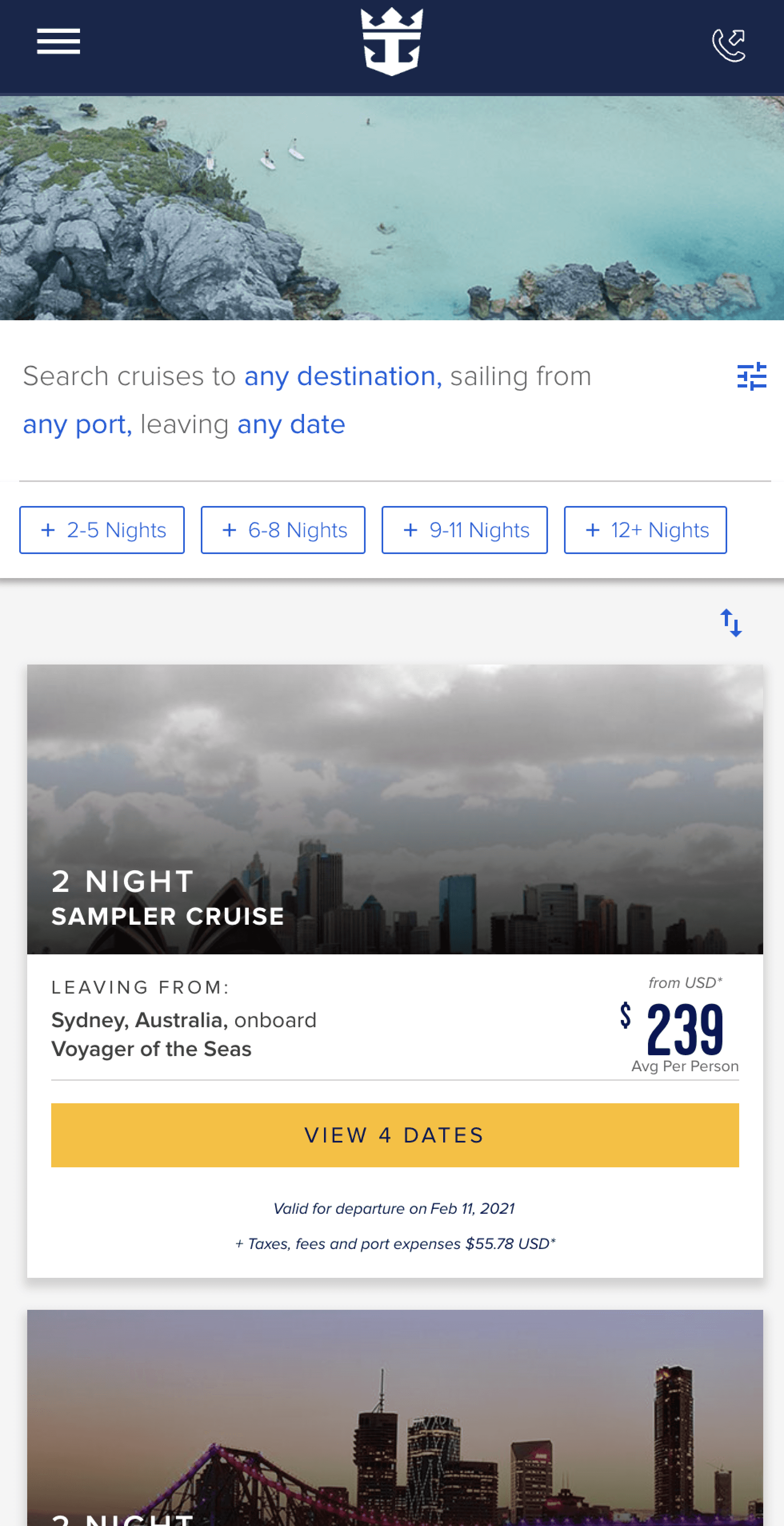
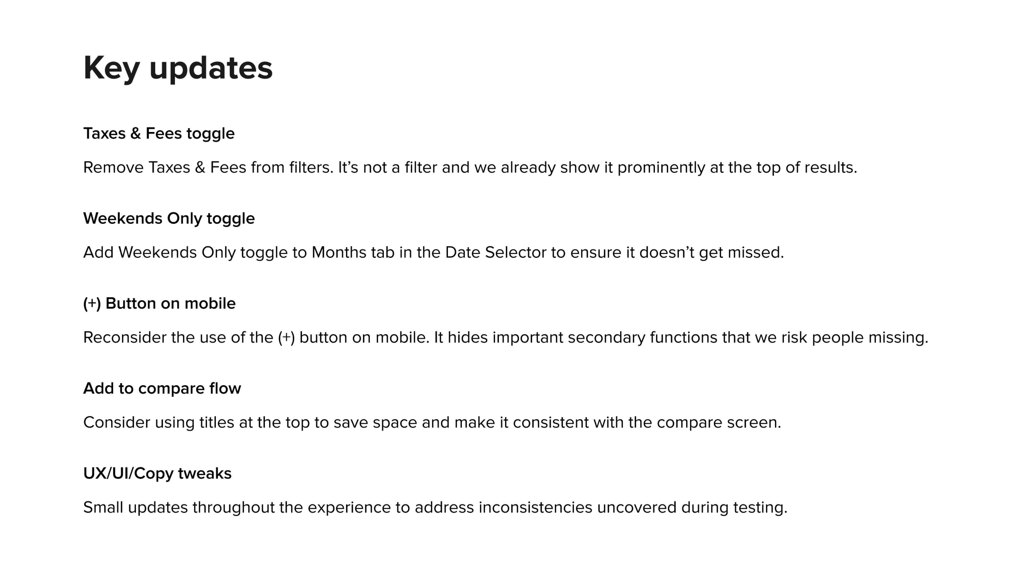
Weekend getaways were becoming a popular cruising option, so I added a "Weekends only" toggle and placed it close to the date selector for a convenient shortcut.
Smart defaults
Since we knew what the most popular filter options are, I made them visible by default, to give people a starting point without having to browse a long list.

Picking up where you left off
Testing revealed that booking a cruise often involves several rounds of deliberation. I introduced recent searches prominently to make it easy to pick up where you left off.

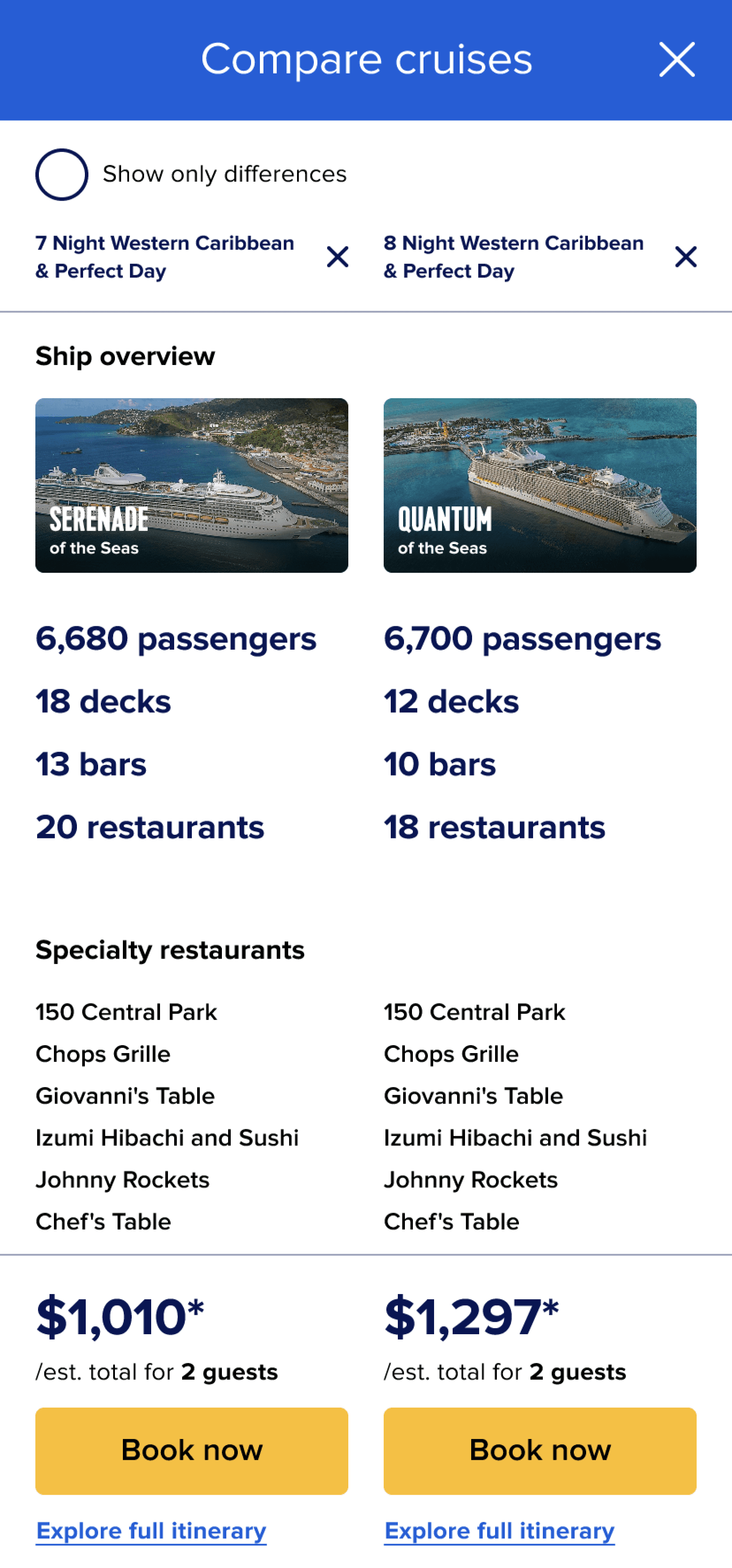
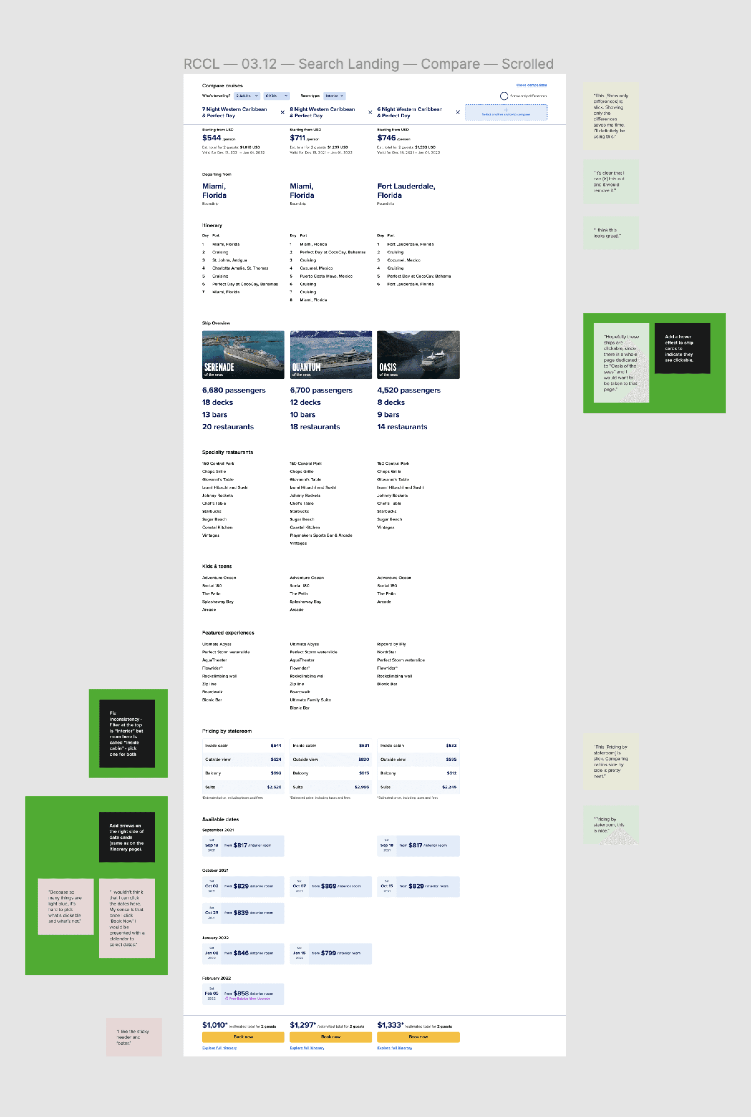
Show me only what's different
I added a "show only differences" toggle to make it easy to focus on attributes important to you when comparing cruises. It delighted usability test participants.
Design
Staying on strategy
I helped create a scalable design system and kept my team mindful of requirements like supporting multiple languages. My wireframes guided design of the experience.

Whenever our redesign introduced new usability or accessibility issues, I provided evidence for they are a problem and worked with my team on fixing them.


The updated visual language stays true to the brand while keeping the interface organized and bringing focus to important content and features.

I made sure that the experience is accessible by helping the design team adhere to accessibility standards and guidelines.
Outcome
How did people react to our redesign?
Our redesign achieved the goals we set out at the beginning of the project and received positive feedback from customers.
Small details add up to big impact
Relatively small features and updates received lots of positive customer feedback.
"There's a Weekends Only radio button? That's awesome! If I want to make sure it's only on the weekend so I don't have to take off from work, I would select it."
Sarah B
Show Only Differences is a hit
Having the ability to only see the differences between cruises when comparing them was praised by customers as a time-saving feature.
"This feature is slick. Showing only the differences saves me time. I'll definitely be using this!"
Jessica F
Transparency = positive affinity
Customers mentioned hating unpleasant surprises at checkout rampant in the cruise industry and appreciated seeing the true cruise price by default.
"I like that 'Include taxes & fees' is one of the first things you see. It's a respectable thing to do for your guests."
Andrea R
Visual references are a big help
Seeing images and videos of important cruise details helps customers better understand differences and decide between itineraries.
"I love the additional info on hover! I think it's a great idea!"
Jaime S